One of the best tools for accurately reporting the current status of a project is burndown chart! Using burndown chart you can track the progress of your project against a given baseline! The chart shows instantly if your project is ahead of schedule or behind the schedule and by how much! Although burndown charts are most commonly used by Agile teams using Scrum project management, they are useful and highly recommended for any other project management technique you may choose for your projects.
Why Burndown Chart?
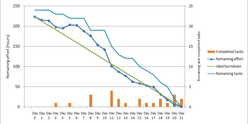
Burndown chart shows the status of all tasks in the task management tool in one graph.
To understand what burndown chart does let go over all elements of the chart in detail. The X-axis in the chart is time (number of days for length of the project).
The right Y-axis is the number of open tasks. The left Y-axis is the effort left to finish the project. The first element of burndown graph is a linear line called the baseline. The baseline is what the team planned for the project. If all goes according to the plan, the dates the project starts and finishes are the same as where baseline starts & ends.
Any time a task is completed during project’s lifecycle, it is recorded by a small red bar at the bottom of the chart. This red bar shows how many tasks are completed on any given day. The second element of the chart is a line (curve), which shows how much effort (man days in hours or days) are left to finish the project. The third line shows the total number of open tasks for each day during the life of the project.
At the beginning of the project, all tasks are still open and no work has been done (effort remaining is maximum), so both graphs start at the upper left of the chart. As the time goes by, tasks are completed and therefore fewer tasks are still open. In addition, the total remaining effort is reduced, so both graphs move to the right in X=axis and down in Y-axis as the project progresses. As long as these two graphs are under the baseline, the project is ahead of schedule. When these graphs are above the baseline, it means the project is running late. The distance from the baseline to these two graphs shows, by how many man days (or remaining op tasks) the project is ahead or behind of the schedule.
Why Burnout chart is so useful you might ask? This tool gives the most accurate snapshot of project’s status at any moment. It is easy to understand and could be easily added to any document or webpage. In project meetings or status meetings the best chart to show to a large audience to report the status of the project is by far the burndown chart.
If you are a start-up, try the best project management software with awesome collaboration feature in the market today to get things done fast. Get your 1-month free trial!


Pingback: Task Management Software - Collaboration Corner
Pingback: Task Management Software - Collaboration Corner
Pingback: Task Management Software - Collaboration Corner
Pingback: Task Management Software - Collaboration Corner
Pingback: Task Management Software - Collaboration Corner
Pingback: Task Management Software - Collaboration Corner
Pingback: Project tracking guide - Collaboration Corner
Pingback: Project tracking guide - Collaboration Corner
Pingback: Project tracking guide - Collaboration Corner
Pingback: Project tracking guide - Collaboration Corner
Pingback: Project tracking guide - Collaboration Corner
Pingback: Project tracking guide - Collaboration Corner